Atelier Talule.
- Atelier Talule /
- Brand Strategy & Visual Identity /
- 2025
a tangled family house, given one brand that stands on its own
The Client
Three generations of craft under one roof, and an audience the house had never served.
A multigenerational jewelry house where every piece carries a story that outlives the maker. Tala grew up in her family's workshop, where her father used to build championship rings and her mother runs fine jewelry and custom. At 17, she decided to build a brand for the audience they never served: young women figuring out who they are through what they wear.
What Was at Stake
She knew what the brand should feel like. There was no system to make it visible.
Three generations of craft lived under one roof, and Tala's vision had always existed inside that larger story. She knew what her brand should feel like, but there was no system to make it visible on its own. A retail expansion was coming, and without a foundation, growing would only make the overlap harder to untangle.

The Decision
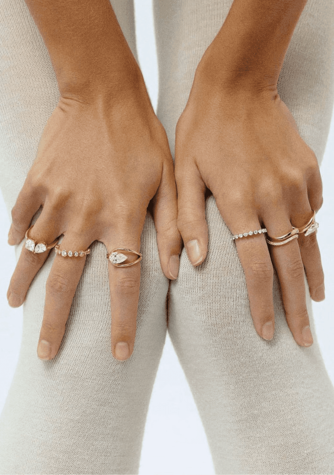
Jewelry as a companion through every stage of womanhood.
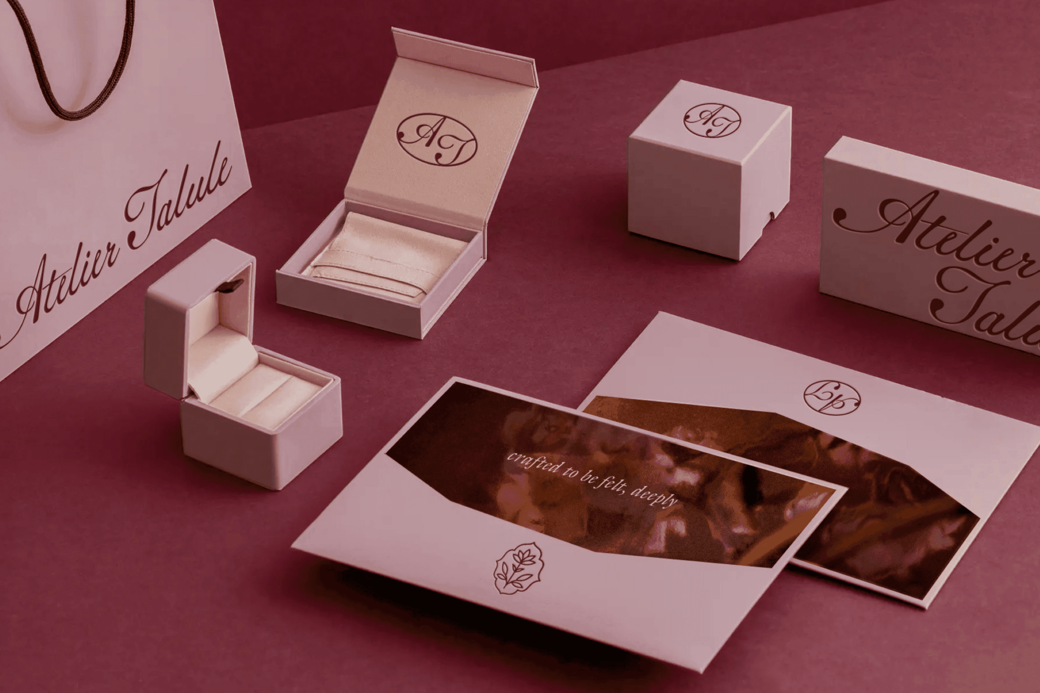
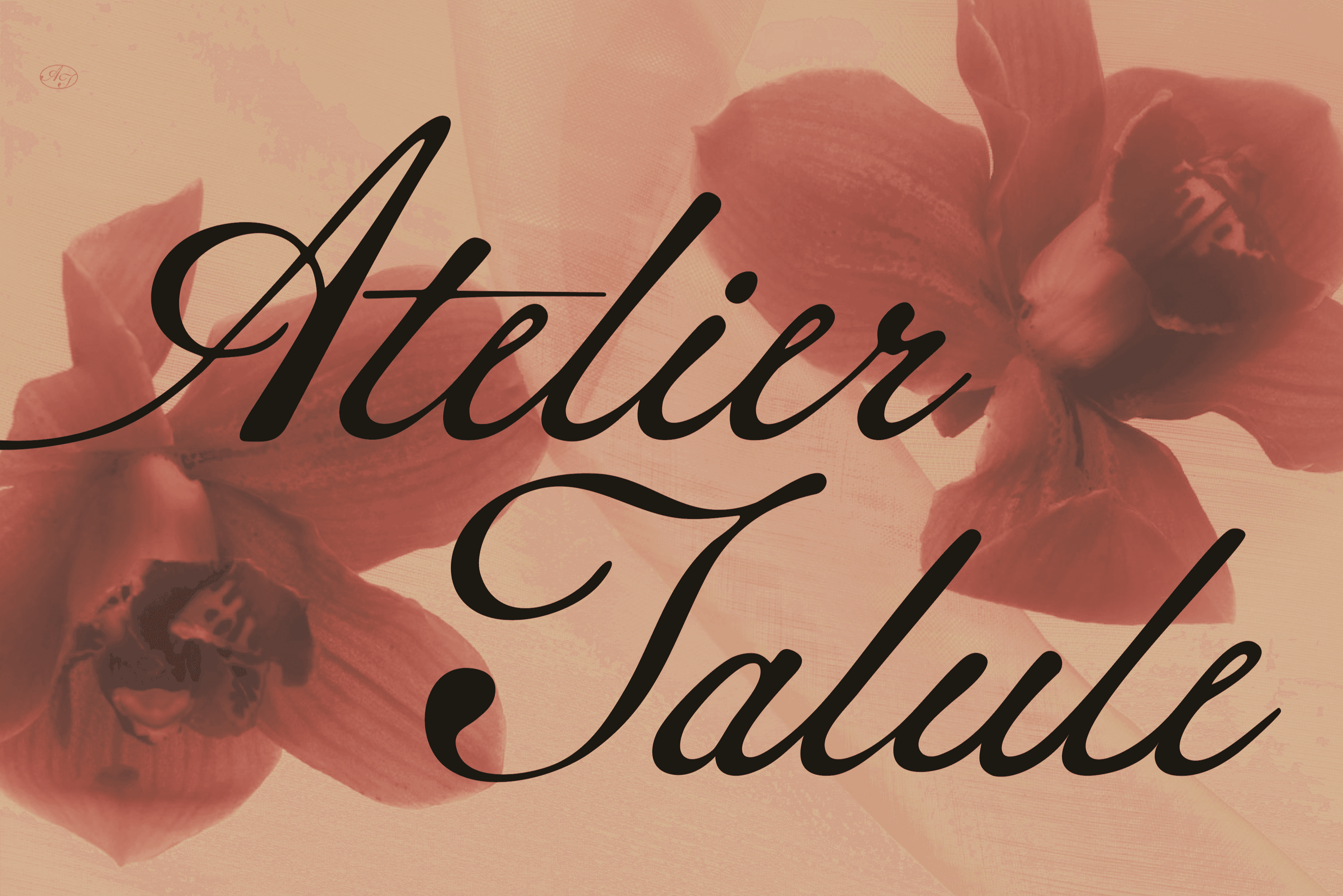
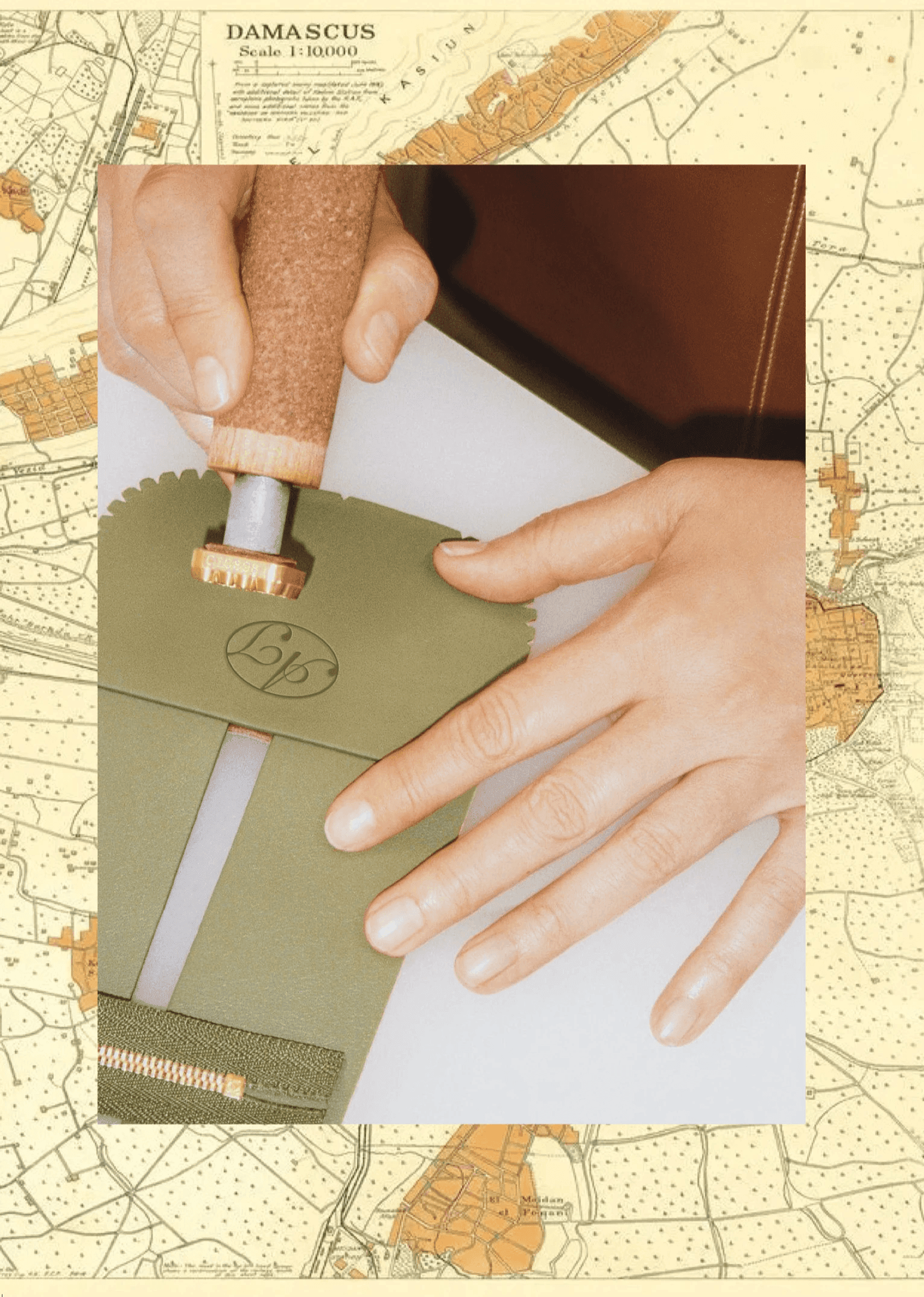
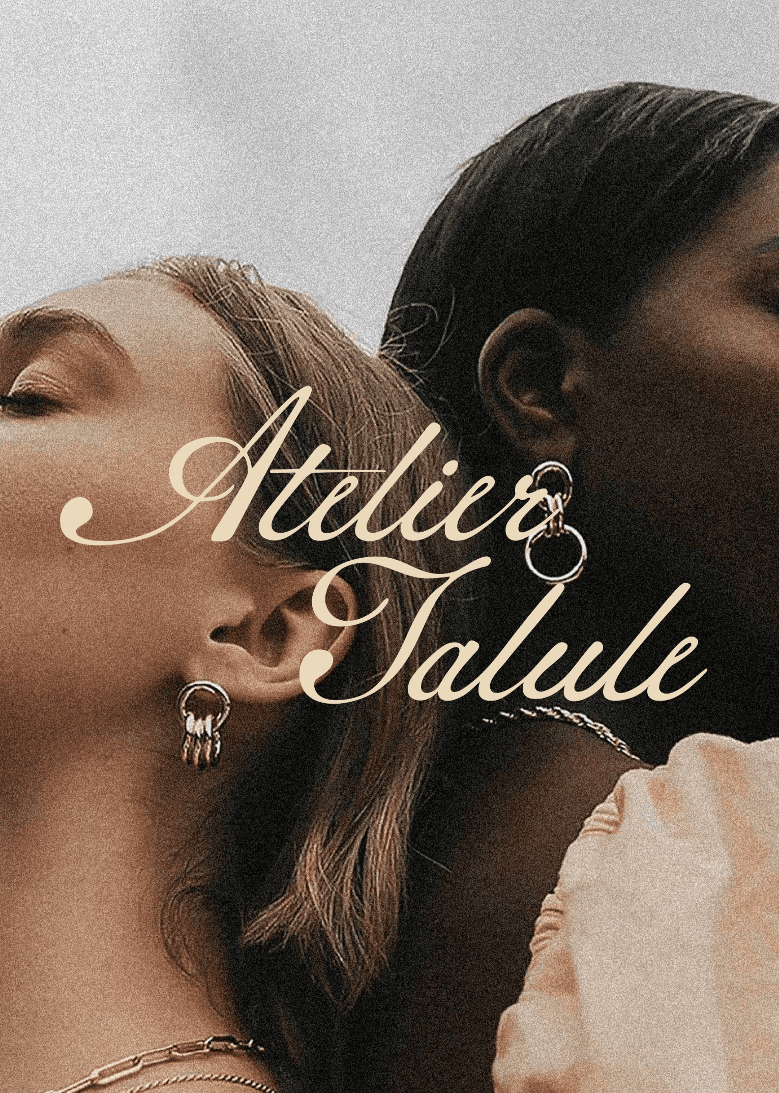
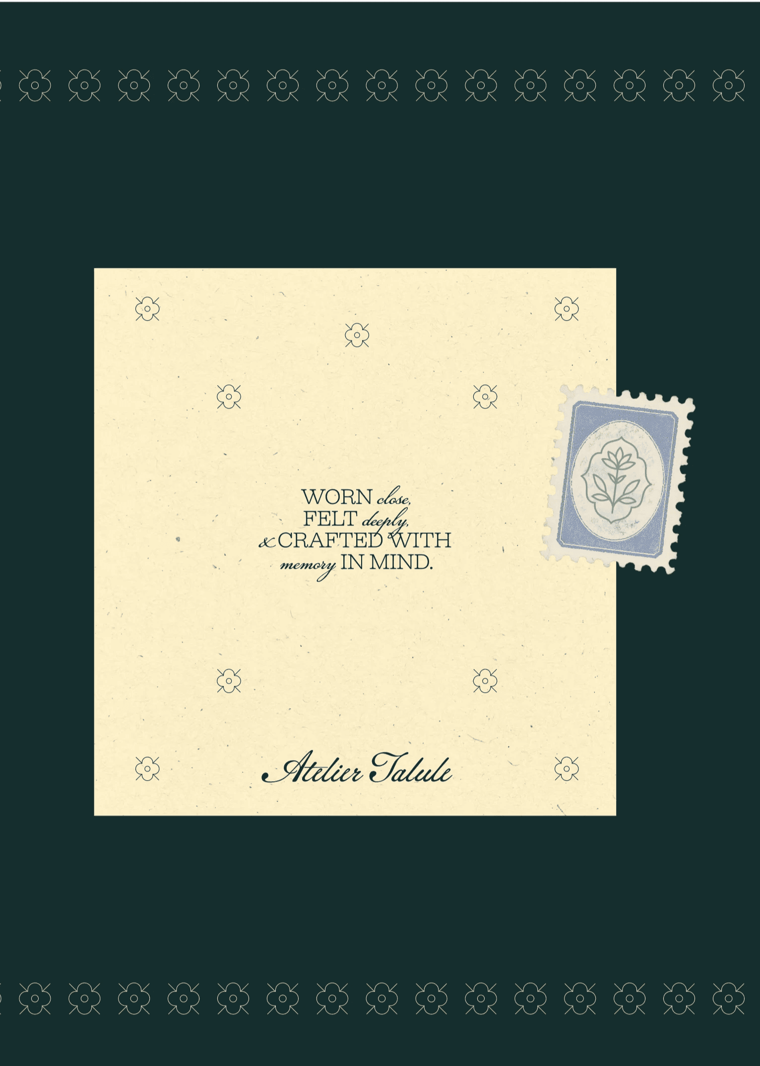
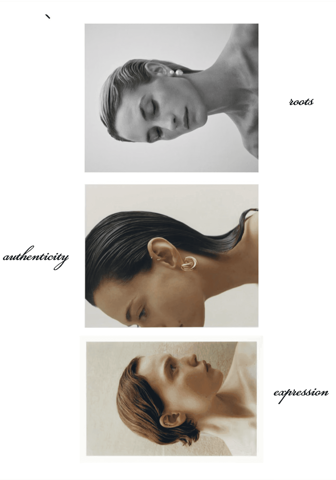
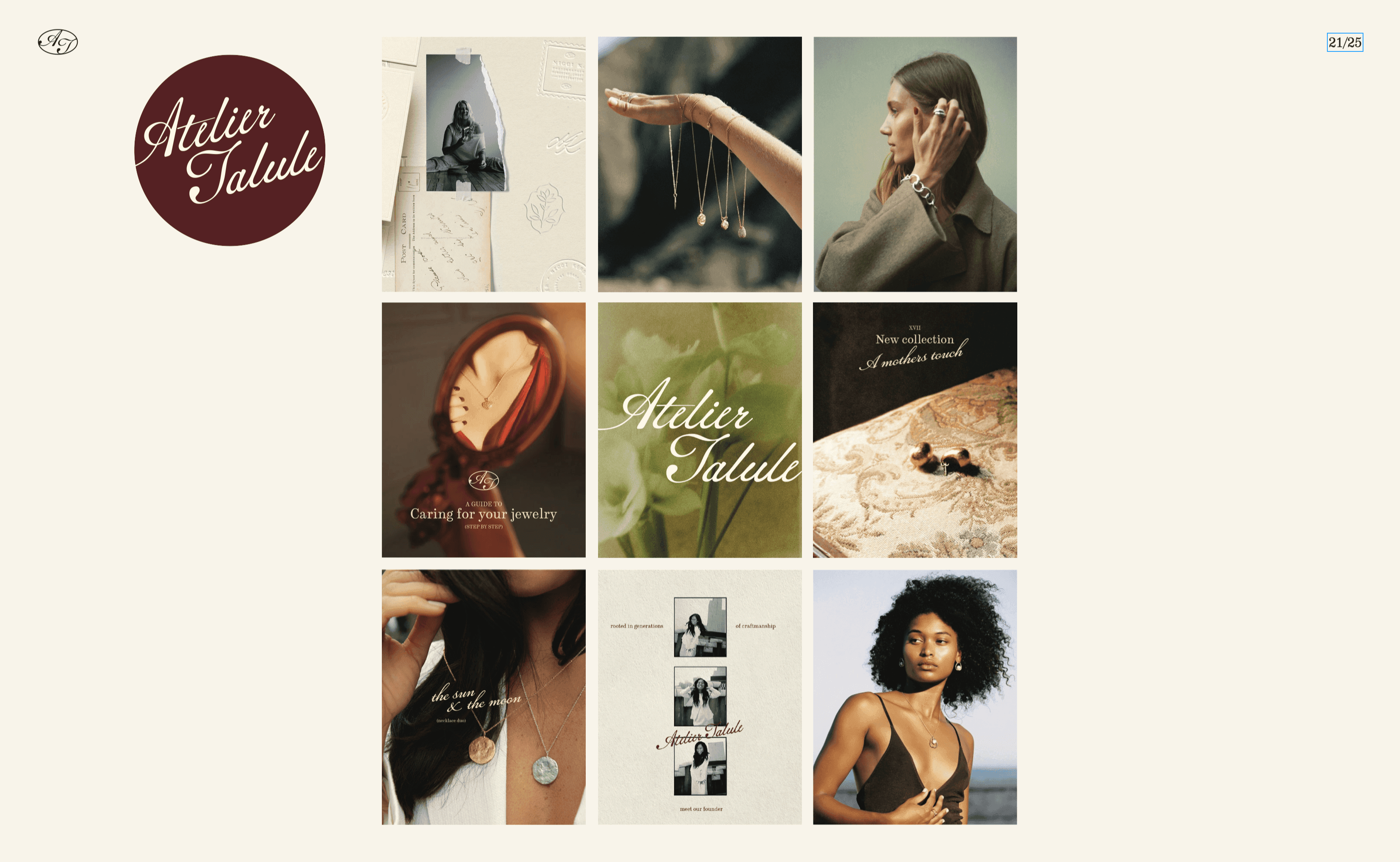
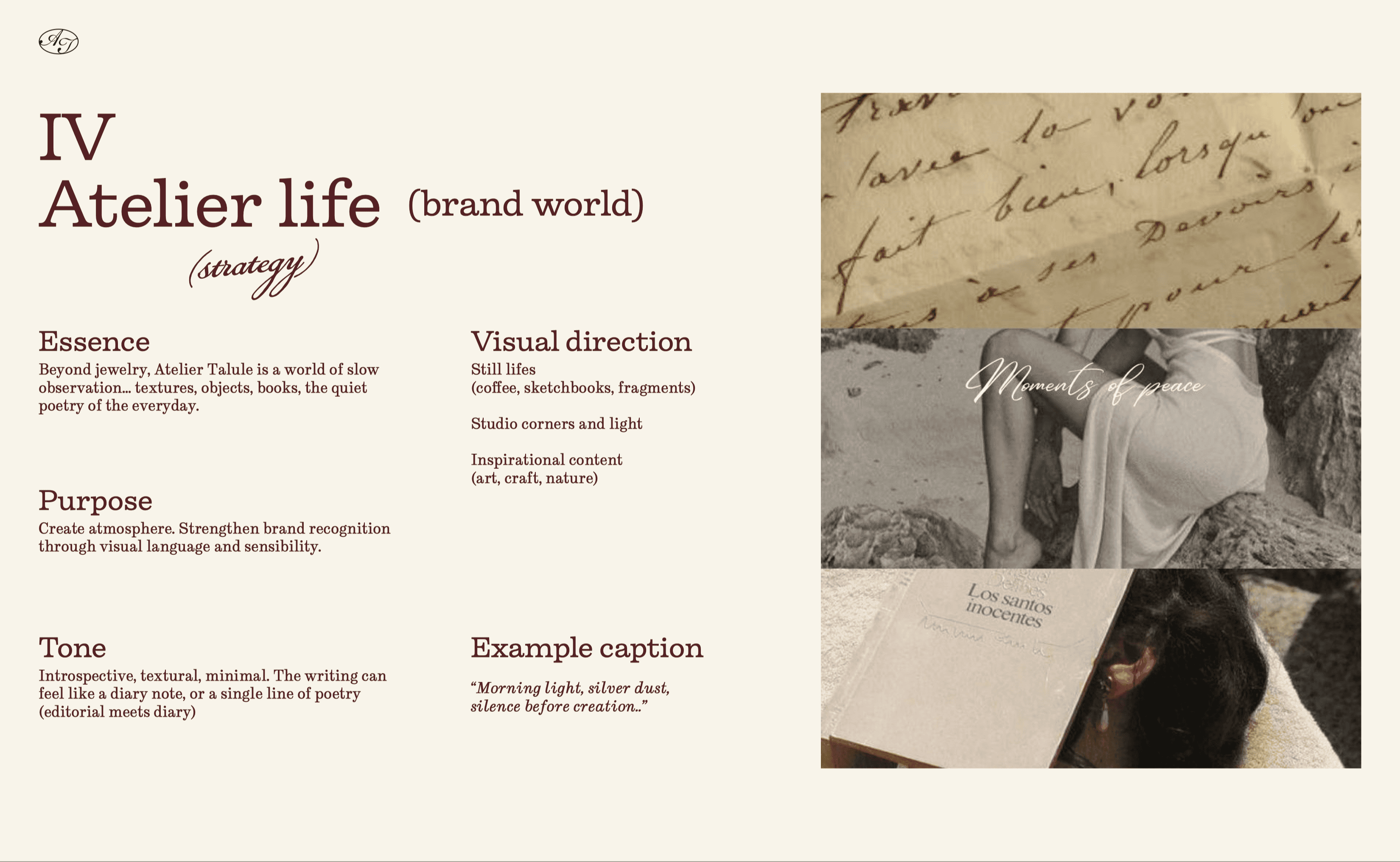
We started by sitting with the family to understand where each brand lived and where one ended and another began. We studied the market and its leading names to find the space that was Tala's to own. We defined two audience archetypes: the young woman building her first collection and the more seasoned woman refining hers. The creative concept anchored on the evolution of womanhood, treating jewelry as a companion through every stage. Our senior designer translated that thinking into a complete visual identity: calligraphic logotype, AT monogram, and a jasmine isotype drawn from Syria's national flower to honor the family's Damascene roots. The color palette gave both gold and silver equal presence. We extended the identity into a 25 page social media guidelines document so Tala and her team could move independently from day one.

What Changed
A system that matches the craft.
The brand now has a system that matches the craft. A 45 page brandbook that holds the complete visual world and a social media guidelines document that gives the team a playbook they can follow without second-guessing the direction. When the founder held the printed brandbook in her hands, she said she loved seeing it come to life. Atelier Talule is now positioned to launch e-commerce, open a retail location, and walk into any partnership conversation with clarity about who they are.
a tangled family house, given one brand that stands on its own

Next story